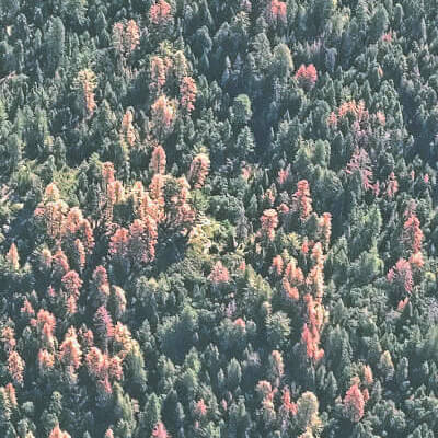
Post-drought mortality mapping
Following severe drought, scientists estimated nearly 100 million trees died from 2015-2016 due to pests, pathogens & stress. Red colors show the location of trees that died in 2016. We mapped this mortality to better understand wildfire hazards & identify restoration opportunities.
Montoring restoration in El Dorado & Stanislaus
Tracking change in vegetation growth & local climate across forest thinning & precribed burn projects. Click on a polygon to show trends for each project. Toggle the tree cover layers to track tree removal & regrowth.
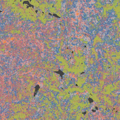
Mapping forest structural heterogeneity
Forest types vary wildly in the Sierras, from the foothills to treeline, timber plantation to old growth. Here, we used a clustering algorithm to group similar forests by structure, with each group assigned a unique color.
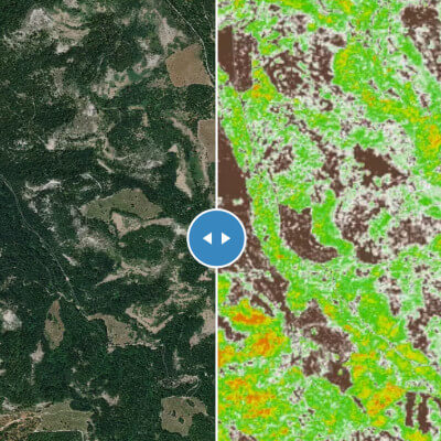
Wall Street Journal feature
This map comparing airborne LiDAR to Salo-derived data was embedded in the article "How AI Might Be Used to Battle Wildfires." It shows the difference in area covered by airborne LiDAR data and Salo's satellite-based mapping. See the Press page for a link to the article.
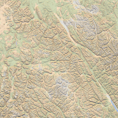
Salo global basemap
We built a new global base map style focused around topography & infrastructure. We use this map style, which emphasizes natural colors, topography & land cover, as a base map for web applications. It doesn't look like much from afar, but zoom in & explore the detail yourself. Contact us if you'd like to use this style.